Search
To search for an exact match, type the word or phrase you want in quotation marks.
A*DESK has been offering since 2002 contents about criticism and contemporary art. A*DESK has become consolidated thanks to all those who have believed in the project, all those who have followed us, debating, participating and collaborating. Many people have collaborated with A*DESK, and continue to do so. Their efforts, knowledge and belief in the project are what make it grow internationally. At A*DESK we have also generated work for over one hundred professionals in culture, from small collaborations with reviews and classes, to more prolonged and intense collaborations.
At A*DESK we believe in the need for free and universal access to culture and knowledge. We want to carry on being independent, remaining open to more ideas and opinions. If you believe in A*DESK, we need your backing to be able to continue. You can now participate in the project by supporting it. You can choose how much you want to contribute to the project.
You can decide how much you want to bring to the project.

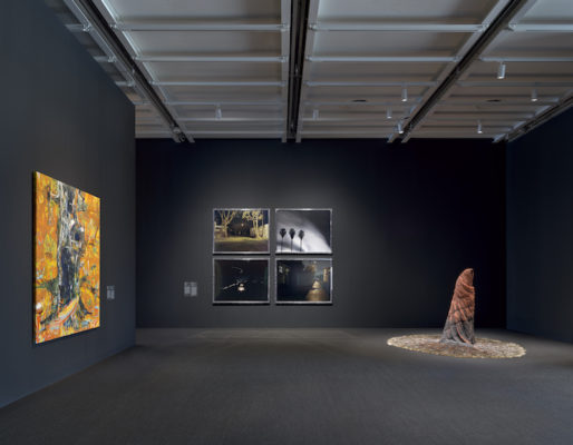
When you step out of the elevator everything goes black, like you’re entering a movie theater. In fact, there are two or three “cinema-like” rooms in the space, though without seats and (almost all of them) without starting times, in which spectators can roam free. This gallery is on the sixth floor of the Whitney Museum in New York, with the large windows designed by Renzo Piano tinted black. Not a trace of natural light in the most important room of the museum’s latest Biennial, which brings together established artists such as Coco Fusco, Trinh T. Minh-ha and Alfredo Jaar, along with lesser-known artists such as WangShui, Jonathan Berger and Dave Mckenzie. The curators, David Breslin and Adrienne Edwards, opt for chiaroscuro (the gallery on the fifth floor is surprisingly luminous) without further contrasts.
Breslin and Edwards point out, in their introductory text, that the pandemic happened after they had organized the Biennale, so any reference to the context of confinement, death and desolation that has come (to stay) in our aesthetic imaginary is random and involuntary, although later works have been introduced (such as the one by Alfredo Jaar, which shows a Black Lives Matters movement protest) that take the fateful date as a reference. Quiet As It’s Kept is the title of this Biennial which consciously mixes video, sculpture, installation, pictorial abstraction, photography, digital art and even Generative Antagonistic Networks; languages and formats in pieces that rarely dialogue with each other. The commitment to hybridism, in this case, is exhausted in the presentation. An anguished need to “inform” on the current state of art runs through the show, and this anxiety (to be liked, to please) is printed on the body of the visitors, a voluntary or accidental effect that only vanishes when, jaded, one opens the terrace doors and finds three sculptures by Charles Ray, Jeff, Burger and Ninety-Nine Bottles of Beer on the Wall: patient in a mental hospital, a drunk college student sitting on cases of beer and a man eating a hamburger. As almost always with Ray, the huge figures reach biblical proportions. Jeff is a “modern parody” of Christ and the two elements of the modern American Eucharist, bread (hamburger) and alcohol (blood). It is the colorless sobriety, the work with scale or sympathy towards the models that prevents these ideas, so parodic, even ridiculous, from being embarrassing. What’s more, you don’t even need to understand them, as Ray always leaves room for enjoyment.
In the corridor that leads to Ray’s sculptures, we find one of the most suggestive installations of the entire Biennial, designed by the young artist Alejandro “Luperca” Morales (1990). Accustomed to working with “archives,” Morales takes ghostly snapshots of the pandemic that do not refer directly to empty streets or masks or hospitals but rather to the memory of a specifically modern gesture that brilliantly captures all the melancholy of the age of confinement: photographs (captures) taken from Google Street View. With this application, Morales travels through his hometown (Ciudad Juárez) trying to escape from the iconographic imaginary with which the border territory is identified. The exhibition of the images is amazing: Morales modifies their format, converting them to 35mm film (thus breaking the conventions associated with the analog/digital split) and inserting the photograms into small slide viewers, like those that were sold in the 1980s and 90s as souvenirs of a city. In this way, Morales “activates” the “operative” images taken by the Google Maps camera car, at the same time as he recovers an obsolete gesture (that of bringing a viewfinder close to one’s eye), materializing a certain idea of heterochrony that, until now, had not detached itself from mere theory. [1]The photographs of the project are accessble in Instagram @archivojuarez, https://www.instagram.com/archivojuarez/?hl=es
Another very young artist, Emily Barker (1992), shows all the cruelty of the American health system in two powerful installations. In Death by 7865 Papercuts, reminiscent of Haacke, the artist, who lost the use of her legs at the age of nineteen after a spinal cord injury and who has to use a wheelchair to get around, produced a tower of paper made up of a year’s supply of invoices from a hospital to which Barker owed over a million dollars. A few meters from the tower of paper, plastic pillars that simulate a kitchen countertop reveal how domestic space is built on the blindness of other bodies. Design standards, Barker reminds us, patronize all those whose bodies do not fit the norm. The transparency of the material (polyethylene terephthalate, used in beverage containers) adds a feeling of vulnerability and desolation to the oppressive environment. The hackneyed and obscure Freudian uncanny does not come into play, but rather an austere confirmation of the implicit normativity in the design of all the spaces we inhabit.
In the Biennial, there is more politics than vindication, more artistic self-determination (hence the insistence on the pictorial abstraction of James Little, Dyani White Hawk and Rick Lowe) than a model categorization into “groups” or “generations.” American identity, a central element in the history of the Biennale and of the museum itself, is here the explicit referent of parodic works, one “from inside” (North American Buff Tit by Eric Wesley), and another “from outside” (Learning English from Becoming American by Rayanne Tabet). While the giant lucky bird designed by Wesley arouses complicit laughter, Tabet’s video installation that ridicules the American nationality test with verbatim phrases, stings. The process of compulsory assimilation of North American “culture” as part of the “change of status” process is full of ridiculous and grandiose phrases that, like ideological pills, build a new “I” (from the migrant to the naturalized citizen) ready to be exploited by the system. The same thing holds true for the youngest artist at the Biennale, Andrew Robert (1995), and his “zombie nightmare,” who in The Horde presents zombies that look at us defiantly from their digital world wearing Uber Eats, Disney and Amazon shirts. This speculative post-human dream awakens class consciousness, and lyrics by Yoko Ono resonate that could well summarize the work of some of the Biennial’s artists: Don’t be afraid to go to hell and back.
(Featured Image: General view Quiet As It’s Kept, Whitney Biennale, curated by David Breslin and Adrienne Edwards).
| ↑1 | The photographs of the project are accessble in Instagram @archivojuarez, https://www.instagram.com/archivojuarez/?hl=es |
|---|

Pablo Caldera (Madrid, 1997) is a PhD student in Artistic, Literary and Cultural Studies at the Universidad Autónoma de Madrid. A graduate in Philosophy, he combines academic writing with narrative and visual arts criticism.
"A desk is a dangerous place from which to watch the world" (John Le Carré)