Search
To search for an exact match, type the word or phrase you want in quotation marks.
A*DESK has been offering since 2002 contents about criticism and contemporary art. A*DESK has become consolidated thanks to all those who have believed in the project, all those who have followed us, debating, participating and collaborating. Many people have collaborated with A*DESK, and continue to do so. Their efforts, knowledge and belief in the project are what make it grow internationally. At A*DESK we have also generated work for over one hundred professionals in culture, from small collaborations with reviews and classes, to more prolonged and intense collaborations.
At A*DESK we believe in the need for free and universal access to culture and knowledge. We want to carry on being independent, remaining open to more ideas and opinions. If you believe in A*DESK, we need your backing to be able to continue. You can now participate in the project by supporting it. You can choose how much you want to contribute to the project.
You can decide how much you want to bring to the project.
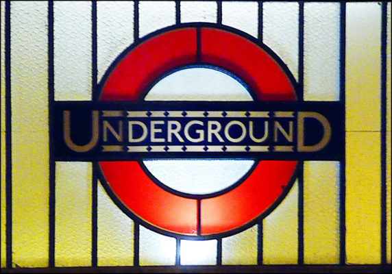
No other city can be said to have turned its mass transit system into a cultural icon so much as London. Other cities have fractions, highlights, moments; the stations of the Moscow metro, each a Stalinist temple to the dignity of the working class, or New York’s yellow cabs, roving nodes of the American Dream, immigration and hard-work, or San Francisco’s trams, surviving remnants of a rare expansionist heritage burnt and shaken to the ground many times over. But London’s transport system, (originally called London Transport, now known as Transport for London) is remarkable for how it has turned almost every aspect of its technics, mechanics and graphics into an iconic stand-in for the city itself. Almost every part of the network — its red double-decker buses, its its black “Hackney Carriage” cabs, its distinctive red, white and blue roundels, even the network’s bespoke typeface — is a recognisable image of London. Perhaps what’s more extraordinary is the affection doesn’t extend simply to tourists and visitors, but to Londoners themselves. It is a collection of design decisions that has knitted itself into the subjectivity of a whole city, a sprawling, creeping mass of connections that has metastasised into Londonness itself. What is so tempting, so reassuring, about London’s mass transit?
Part of the allure must lie in a visual presence in public life that is so remarkably consistent. Rebrandings, corporate takeovers and mergers have produced, in the late capitalist city, a sense of visual insecurity that seems to match the constant gentrification and remodelling of the built environment in a city that never seems to be finished. Transport for London, meanwhile, holds a visual identity that pre-dates the First World War, and whose aesthetic and purpose is interlocked with a very British idea of modernism. While everything else changes, the idea of the transport system remains the same, a comforting reminder of one’s childhood, one’s mother’s childhood, and one’s grandfather’s childhood. It was, and remains, both a quotidian visual language and an everyman’s system, associated with London’s middle class, the clerical workers upon whose backs the complex systems of management of city and empire were constructed. Indeed, in the British legal system the phrase used to describe a “reasonable” and “right-thinking member of society” against which assumptions can be measured is “the man on the Clapham omnibus”, a phrase in use since the turn of the twentieth century, when Clapham was a middle-class commuter suburb. It’s fitting, then, that godfather of this visual system was Frank Pick, not a radical or a visionary but a middle-manager, a child of the Victorian lower middle class. As a publicity manager for “Underground Electric Railways Company of London” (UERL) in 1908 he began a long process of rationalisation in the company, including attempting to increase traffic outside of peak travel hours by use of advertising. The standardisation of advertising for the network brought with it a new typeface designer by Edward Johnston, introduced in 1916 and still the typeface of the network today, and new platform roundels displaying station names in a consistent format.
As the network expanded, Pick took charge of the architectural design of new Underground stations. He was clear that the network’s identity, and hence the architecture, should represent not a mangled classicism but a new, modern London. Despite his middle-manager credentials, it’s striking how this bureaucrat held a design philosophy remarkably close to the modernists of the period, claiming “the test of goodness of a thing is its fitness for use. If it fails on this first test, no amount of ornamentation or finish will make it any better; it will only make it more expensive, more foolish.” Pick also commissioned artworks for stations and the company headquarters, including a provocative frieze by the sculptor Jacob Epstein. The combination of modern architecture of this period, and the modernist visual design, stuck; when London consolidated its transport network in the 1930s, they adopted it, and introduced a new schematic map for the underground network, “the Tube map”.
The visual identity was only part of the design story that London’s transport network tells. It’s also accompanied by the industrial design, not just of tube stations but also of the vehicles themselves, from the low, curving lines of the Metropolitan Line trains (designed to fit the Victorian era tunnels: some of London’s transport infrastructure dates back to the Industrial Revolution) to the spacious, bulky black cabs, specifically built with a turning circle that allows the driver to turn around on the narrowest roads.
Perhaps the most iconic of these designs is the bright red Routemaster bus, with an open rear platform allowing passengers to board and alight at any point. Introduced in the 1950s, the bus still runs on some heritage lines in the city centre. Yet Londoner’s relationship with this transport network is not uncomplicated, as might be expected from such a ubiquitous public service, and even pride in the services is a subject of satire. Even in the 1950s the English comedy duo Flanders and Swann gently mocked the attitude in their comedy revue “At the Drop of a Hat”, performing the song “A Transport of Delight” in which they took the roles of a driver and conductor of one of the new Routemaster buses.
‘We don’t ask much for wages, we only want fair shares, so cut down all the stages, and stick up all the fares. If tickets cost a pound apiece, why should you make a fuss? It’s worth it just to ride inside, that thirty-foot long by ten-foot wide, inside that monarch of the road, observer of the Highway Code, the big six-wheeler, London Transport, diesel engine, ninety-seven horsepower, ninety-seven horsepower omnibus! Hold very tight please – ting ting!’
Other representations are darker; in The Jam’s 1978 song “Down in the Tube Station at Midnight” the network becomes a site of social breakdown, anomie and racist violence as the protagonist is attacked in the deserted station:
‘I felt a fist, and then a kick, I could now smell their breath. They smelt of pubs and Wormwood Scrubs, and too many right-wing meetings… the last thing that I saw, as I lay there on the floor, was “Jesus Saves” painted by an atheist nutter, and a British Rail poster read “Have an Awayday – a cheap holiday – do it today!”’
Yet the network’s design remains a point of attraction for many Londoners. Perhaps it is its open associations garnered over a century; for some it’s a form of soft-nationalism, a nostalgic Englishness in the same mode as the Spitfire and the Mini Cooper, a time when Britain was Great. For others, it stands in for a soft-socialist, modernist vision of London as it could be, as it exists in their own imaginations: a city that works for the people (if one closes one’s eyes to the city’s transformation into a playground for financial capital, and a sausage machine of exploitation for the working class). Perhaps that openness to meaning and identification is its strength; London’s transport network is almost a Gesamtkunstwerk, a piece of living art whose ubiquity makes it a backdrop from millions of lives, and holds memories of joy and death, loss and desire, all carried along by the smell of oil and fumes, and the sooty black residue that rests upon the commuter’s skin.
(Features Image: George Rech)

Huw Lemmey is a novelist, artist and critic living in Barcelona. He is the author of three novels: Unknown Language (Ignota Books, 2020), Red Tory: My Corbyn Chemsex Hell (Montez Press, 2019), and Chubz: The Demonization of my Working Arse (Montez Press, 2016). He writes on culture, sexuality and cities for the Guardian, Frieze, Flash Art, Tribune, TANK, The Architectural Review, Art Monthly, Pin-Up Magazine, New Humanist, The White Review, and L’Uomo Vogue, amongst others. He writes the weekly essay series utopian drivel and is the co-host of Bad Gays.
Media Partners:


"A desk is a dangerous place from which to watch the world" (John Le Carré)